I was recently testing a sensor which needed calibrating. This involved plotting some data and making some adjustments based on the resulting graph. As a Windows user this is a task I would normally perform in Microsoft Excel or LibreOffice Calc.
In this case I decided to try to do it on the Pi given I was already working wthin the LXDE environment. Could I do some simple plots without getting frustrated with tons of obscure command line syntax?
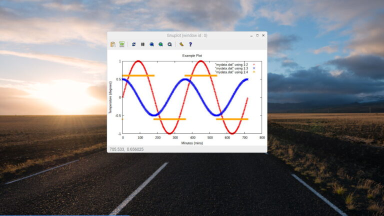
 The answer was yes and came in the form of “gnuplot”, a command-line driven graphing utility. It’s got a lot of options but it only takes five minutes to master the basics.
This tutorial just scratches the surface but aims to provide a quick reference for creating graphs from simple datasets.
Install gnuplot
To install gnuplot on the Raspberry Pi use the following command :
sudo apt-get install gnuplot-x11
You may have to answer “Y” if prompted.
Generate Some Example Data
In order to do the example plots I needed some test data. Here is a simple Python script to create some test data. It creates a plain text file called “mydata.dat”. Each line contains a set of data points where each number is separated with a space character.
#!/usr/bin/python
import math
f = open('mydata.dat', 'w')
# Loop
for degrees in range(720):
  # Generate three data points
  si = math.sin(math.radians(degrees))
  co = 0.5 * math.cos(math.radians(degrees))
  if si>0:
    sq = 0.6
  else:
    sq = -0.6
  # Write 3 data points to text file
  data = "{} {} {} {}\n".format(degrees,si,co,sq)
  f.write(data)
f.close()
You can download this script directly to your Pi using :
wget https://bitbucket.org/MattHawkinsUK/rpispy-misc/raw/master/gnuplot/gnuplot_generate_data.py
Run it using :
python gnuplot_generate_data.py
The script will create “mydata.dat” and the contents will look a bit like this :
0 0.00 0.50 -0.60
1 0.02 0.50 0.60
2 0.03 0.50 0.60
3 0.05 0.50 0.60
4 0.07 0.50 0.60
5 0.09 0.50 0.60
6 0.10 0.50 0.60
7 0.12 0.50 0.60
8 0.14 0.50 0.60
9 0.16 0.49 0.60
10 0.17 0.49 0.60
....
The first column is just a number sequence. The other three columns are our data. If you were plotting temperature you may only have 1 column of data. I used three for this tutorial to make the example plots a bit more interesting.
Plot The Data
If you haven’t already launch the graphical environment by typing :
startx
You can launch gnuplot by either typing “gnuplot” in a terminal window or using the shortcut under XXXXXX. You will be presented with a command prompt awaiting your instructions.
To plot data you can enter :
plot "mydata.dat"
This only plots the data from the 2nd column. To plot the two other sets you can type :
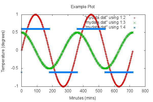
plot "mydata.dat" using 1:2, "mydata.dat" using 1:3, "mydata.dat" using 1:4
This tells gnuplot to plot three sets of data using columns 2, 3 and 4.
Many of the customisations you can make to your graph are either made by adding parameters to the “plot” command or issuing “set” commands.
Setting a Plot Title and Axis Labels
To change the plot title you can type the following command :
set title "Example Plot"
To change the data labels you can modify your plot command :
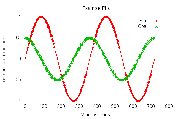
plot "mydata.dat" using 1:2 title "Sin", "mydata.dat" using 1:3 title "Cos"
This can be abbreviated to :
plot "mydata.dat" u 1:2 t "Sin", "mydata.dat" u 1:3 t "Cos"
To change the axis labels you can use the following commands :
set xlabel "Minutes (mins)"
set ylabel "Temperature (degrees)"
Lines and Points
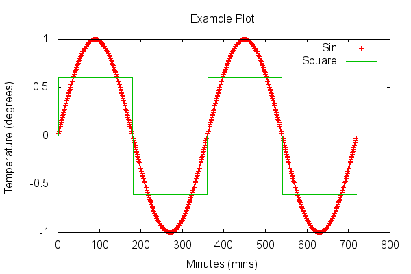
You can also change the way the data points are represented on the graph. By default points are used. You can change the style to “lines” or “linespoints” using the “with” keyword :
plot "mydata.dat" u 1:2 t "Sin", "mydata.dat" u 1:4 t "Square" with lines
This makes the square wave look nicer.
Colours
It’s easy to change the colour of your data. Just use the “lt” paramenter :
plot "mydata.dat" using 1:2 lt rgb "blue", "mydata.dat" using 1:3 lt rgb "violet"
You can use a range of colours including black, red, green, blue, magenta, cyan, brown and light red.
Customising the Axis Scale
By default the axis will autoscale. Most of the time this is fine but you may want to tweak the axis values to make it look a bit nicer. You can either use :
set yrange [-1.5:-1.5]
or modify your plot command :
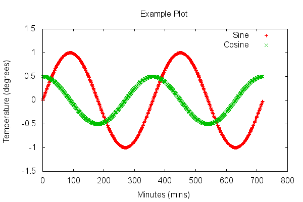
plot [] [-1.5:1.5] "mydata.dat" u 1:2 t "Sine", "mydata.dat" u 1:3 t "Cosine"
In our example we modified the y-axis and this would give us a plot like this :
You can reset the axis auto-scaling with “set autoscale”.
Here is a final example :
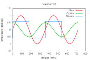
plot [] [-1.5:1.5] "mydata.dat" u 1:2 t "Sine" with lines lw 2, "mydata.dat" u 1:3 t "Cosine" with lines lw 2, "mydata.dat" u 1:4 t "Square" with lines lw 2
In this final example I’ve changed the data to use “lines” and added a”lw” parameter to increase the line width to 2. Modifying the y-axis has also ensured the key doesn’t clash with the data lines :
Other Tips
When you’ve changed settings using the “set” commands you can quickly re-draw your graph using “replot” rather than using the complete plot command. Don’t forget to use the up and down arrow keys to recall previous commands. That saves a lot of typing!
gnuplot can do lots, lots more but hopefully the information here is enough to get you started.



13 Comments
Outstanding. This is precisely what I’ve wanted, but just haven’t gotten around to researching. I’ve been prototyping a RasPi-based combined weather station and HVAC monitoring station for my home, and wanted to work on an automated graphing solution. This looks like the basis on which I’ll be adding that to the project. In all likelihood, I’ll be writing python scripts to standardize the formatting of the data I’m generating. After reading some of gnuplot’s FAQ, it appears that the output format options are outstanding and provide quite a bit of flexibility, so I should be able to easily create a script that uploads the resulting graphs to a website automatically via FTP.
Thanks for covering this topic.
Glad it was useful. The other thing that is great with gnuplot is that you can create a script file with all the “set” commands in it so you can create a plot in one go. You can also get it to create PNG files. In fact I used that feature to create the images in this post … although I cheated and used a laptop for that!
Since you are already using Python to generate data, you may be interested in using powerful Python plotting modules. My favorite is matplotlib. I’ve seen pages where people have gotten matplotlib up and running on a Pi, but I’ve not done it yet myself.
Nice post!
How can I plot data obtained from a C (or Python) code? I mean, I have a code that generates some data, and I’d like to plot it! (as part of the program, of course)
For plotting directly from Python you should consider the matplotlib library (http://matplotlib.org/).
Feb 8, 2015
Thanks Matt, I’ve used gnuplot off and on for years and like it very much.
Now I have an Rpi – following your tutorial above, I cannot get ‘gnuplot-x11’ to work. I downloaded exactly as you list the command above, trying it both with just ‘….gnuplot’ and with ‘… gnuplot-x11’ with identical results. Neither shows up in the ‘Menu’ after startx, even after rebooting. Launching from terminal just displays the Gnuplot welcome message (in the terminal) and waits – but ANY input just bombs out of the program. Any suggestions?
jrc
OK I got it all working, thanks to my old book ‘gnuplot in action’ by Philipp K. Janert.
Needs a configuration file in home directory. Apparently gnuplot reads, on startup, a file named ‘.gnuplot’ in home directory, if there is one. So I just put ‘set terminal x11’ in there and gnuplot works from command line, in any directory, as long as I am ‘pi’.
Sorry to have taken anyone’s time.
jrc
super duper nice. the one piece of information that I definitely need to know now, and I’m gonna look for it on the web: How do I run scripts in gnuplot, so that I do not have to do all the typin next time I want to plot my logged data.
Regards
Use the Gnuplot command ‘save’ to save whatever your current plot is in a file named as you wish. It will be saved in a standardized format. Then you can reload the plot as-is in a subsequent session with a ‘load’ command naming that file, and continue with your interactive session.
But here’s what the smart money does. Get the plot about 90% done in an interactive session. Save it as described above in a file named, say, ‘myplot.gp’. Then use your favorite editor to make the final corrections, saving it each time to the same file. Reload it as often as you like to monitor progress with a ‘load myplot.gp’ command . Voilà! No need to retype anything but the latest hacks. This procedure has many, many advantages — too many to list, but you soon will discover them all.
Where do I have to download GNUPLOT package? I tried downloading several version yet it says ‘Unable to locate package gnuplot-x11 / gnuplot’. Thanks
You should be able to simply type “sudo apt-get install gnuplot-x11” on the command line or from a terminal window and it will install. Try running “sudo apt-get update” first. I’ve just tried it on a fresh Raspbian install and it works fine.
Thanks for your work. Having saved my data horizontally, rather than vertically, I will have to re-run my test!
For some reason “startx” upsets everything on the screen but entering “gnuplot” only in the Terminal works fine. I remember having trouble with “startx” a few years ago & never resolved it.
That’s easy to install. However, it will install still gnuplot 4.6 on the Raspberry. How to install gnuplot version 5.2 or newer?