For a number of months the Raspberry Pi Foundation has been planning a website re-design. They have also been putting together an education hub that would make lots of learning resources available to teachers, parents, kids and hobbyists.
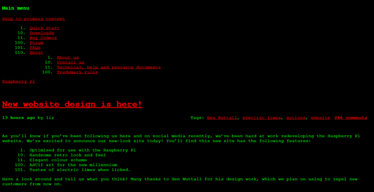
On 1st April the www.raspberrypi.org site got a facelift. It wasn’t what most people where expecting.
For some the black background and lime green text was too much. For others it was a chance to relive the 1990’s.
Luckily this brief nostalgia trip didn’t last and the 2nd April saw the release of the genuine re-design. Here is a video I created to mark the release of the new design while showing how the site has changed over the last three years :
I’m liking the new design. The navigation is clear and simple and the whole feel will be friendlier to new users. If in doubt a single click on the “Help” option will have people up and running in no time. Even the download page has been lovingly re-styled.
The next step is a new theme for mobile devices. Congratulations to the Raspberry Pi Foundation Team!


